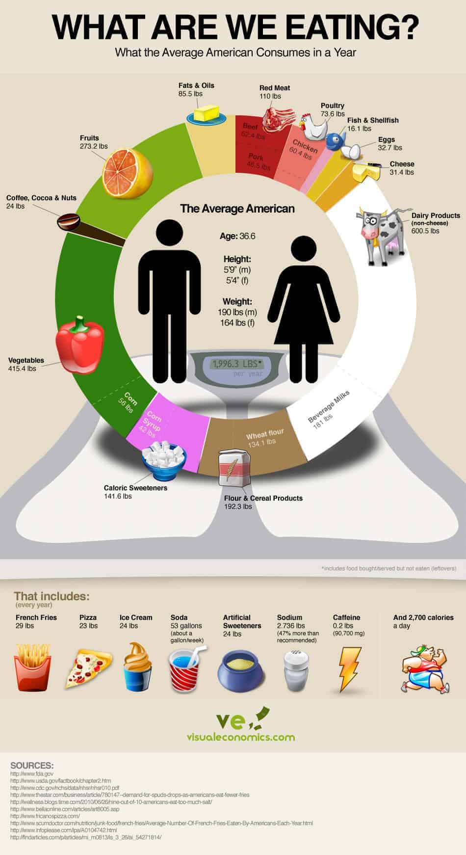
From the very talented folks at Visual Economics comes a graphic of what the average American eats in a year. All told, that includes 1,922 pounds of food. One-third comes from fruits and vegetables, which is still a lower amount than what federal guidelines suggest (USDA
recommends they make up half of the American diet). The rest of the chart is not exactly a pretty picture: we’re eating, for example, 24 pounds of ice cream per year and drinking about a gallon of soda each week. Full graphic after the jump and in full size
here


No comments:
Post a Comment